Hi Everyone – Neil here!
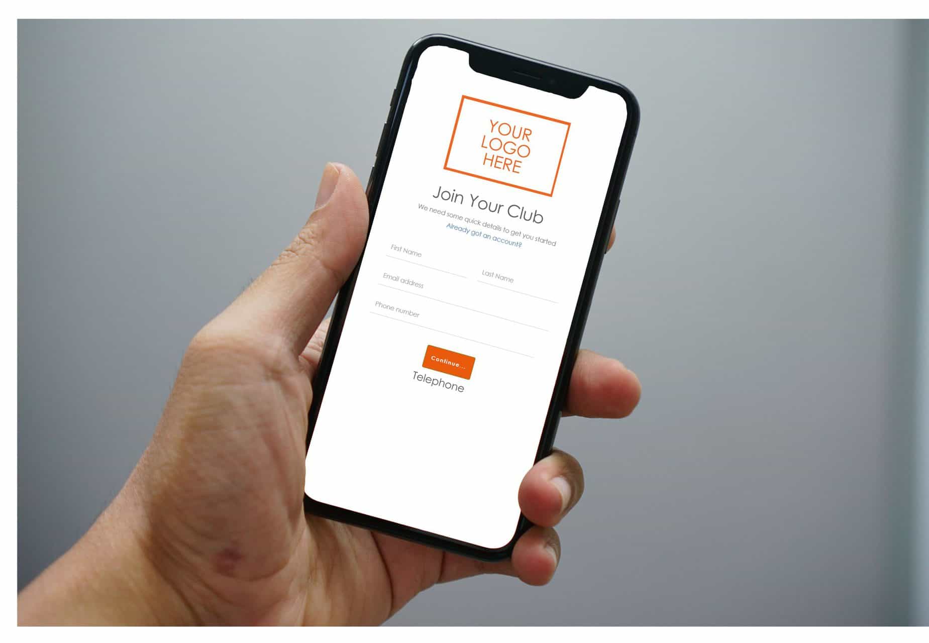
All too often I see clubs that are not optimising their online joining process for their members. According to current reports, 69% of users said that they are more likely to buy from businesses with a site that easily addresses their needs and questions. Making sure your online joining process is seamless on mobile has never been more important!
With that being said, I’ve written a list of 10 tips on how to fully optimise your online joining, so that you can make it easier for people to join your club without even leaving their sofa!
1. The link to your Online Joining Page should be on every single page of your website – behind a button, some text – as long as it’s on there!
2. You should also have a page on your website specifically showing all of the memberships you have to offer, with the details clearly broken down into short points so that your visitors can understand what they are buying quickly. If your list of memberships looks too long, you may want to think about if they’re all necessary.
3. Having a Join Now button on every page is crucial – your visitors can decide that they want to join at any point during their time on your site. Make it easy to spot and make sure it stands out!
4. From clicking your Join Now button, your visitor should be taken straight to a page where they can start entering their details. Any more than two clicks, and you will have lost their interest. Keep it simple.
-
5. Share your joining link on social media! It’s an easy, FREE form of online marketing – you can even get your members to share it in exchange for discounts on products sold in your club!
-
6. Your online sign-up platform should fit the screen on a mobile device, as after all, let’s not forget about that statistic mentioned at the start of this post! A website with a poor mobile view may appear as untrustworthy to potential members, which can deter them from purchasing.
-
7. It is wise to show a maximum of 5 membership options online. It’s perfectly fine to sell more than this in the club, but putting them all online can be daunting and confusing for someone that is about to join your club – The online joining platforms are supposed to help make the member journey enjoyable and easy, not bombard potential members with information!
-
8. Images sell. Make your membership plans look appealing and where possible use pictures of your own gym, members using the equipment and staff. Show that you offer a sense of community and work with real people to achieve their goals. After all, you do not want people to feel intimidated before they come in.
-
9. Buying a Membership shouldn’t take any longer than five minutes, whether that’s a Direct Debit sign-up or an Upfront Card Transaction. How long does yours take?
-
10. Finally – and maybe most importantly – if someone starts the sign-up process and then drops off, do you still capture their details anyway so that you can follow up on them? If not, how do you know how many people have even been on there to look, but never ended up completing their sign-up? If that’s a scary thought to you, perhaps you should take a look at your current process!


